Tuesday, October 6, 2020

CHECKING OUT THE STORES AT RIOCAN PLAZA ON BURLOAK

 Well now that I am a little settled in our temporary home I have some stores to visit to see the fall goodies.  I will need to show some self control considering the huge amount of  'stuff' we had loaded into the moving truck.  It never hurts to just look.  I am also returning to the Oakville Trafalgar Memorial Hospital as a volunteer in the Gift Shop this week.  It will take a lot of self control not to spend there as they have the absolutely most amazing merchandise. 

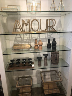
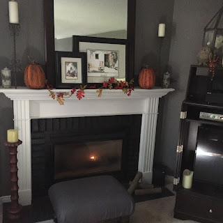
Well back to a little 'browsing', this time at Urban Barn.  Love this store.  They always have the most up to date products and great value for your money. I have a few photos of some of their merchandise and I know you will love it.  As we enter fall and soon winter we think cozy and they definitely have cozy.  One of the dominant colours was cognac which does give a feeling of cooler weather coming and the need to be cozy.  Its a nice warm colour. We also see a lot of grey which has been around for years but we love it as a warm neutral. Urban Barn  has such a vast array of unique decor items you want them all.


Monday, September 28, 2020

Starting a new chapter!!

Well Its been a couple of years since my last post.  I had a lot going on during that time.  I simplified my business, had a total shoulder replacement, became a volunteer at our local hospital, sold my home, learned to live safely during this pandemic and became a gramma!!

Now that we are embarking on our 3rd chapter I have decided to resurrect my blog and incorporate parts of my former website which no longer exists.

I don't get out too much to events and showrooms, obviously, however I am keeping up via social media, magazines and home design shows on TV.  I had to do something to fill the gap during this time. Having sold my home we are currently looking for a new place in a new town. We are living in a hotel at present. When I find it I will share here.

This move was horrendous being that we had been in this house for 25 years.  One surely does accumulate a lot of stuff.  We donated to donation centres, rented a large bin for the driveway to dispose of stuff, went to the dump, sold some things and still required 5 men and a 53' moving van. We had Bronte Movers do our move and they are amazing and so organized.  The 5 men they sent to our home were the best I have ever dealt with and back in my early days we moved a lot so I know good movers. When our belongings were on the truck ready for storage I realized I would have to get rid of more when we finally move into our new home and start unpacking.  I will be donating much more!

Bye for now.  Will return soon!


Tuesday, March 13, 2018

Transitional Design

I planned on writing an article on this topic, however when I came across this by Steven Sabados I knew he had nailed it  so here it is.......

Not too fussy, not too stark: Steven Sabados breaks down the hard-to-define transitional design

How to build a balanced room that looks and feels just right

Transitional design has been described many ways: updated classic, contemporary decor, modern classic, modern traditional... many people have been trying to define it, but transitional seems to be the name that has stuck! Transitional most often describes the room as a whole. At the core of this style is the balance of modern and traditional design. The real appeal is the style's ability to have the best of both worlds – it's not too fussy, but not too stark or cold. Furniture pieces in varying applications can take on totally different looks, so this style is all about how they come together to create a harmonious and balanced space. Here is what Steven Sabados says to keep in mind to achieve the look.
Simple profiles
Transitional blends the comfort and coziness of traditional design with the clean lines and profiles of the contemporary look. The fastest and easiest way to begin to achieve a transitional look is with your furniture, providing you with a harmonious space that meets somewhere in the middle of traditional and modern.
For sofas, such as the one above, anything with a traditional line should not be ornate. This one has a relatively low profile and more contemporary nailhead detail. The gentle curves need to be balanced with something more rigid within the space, but in general, opt for a sofa with narrow and sleek arms so that you can get that nod to traditional design while still saving on space.
These low profile chairs are simple but not cold or uncomfortable in their design. Their rigid lines help balance out the softness of the sofa. The elongated legs make the chairs feel elegant and modern, and the print adds visual interest without adding a lot of distracting colour to the space.
It is always a great idea to round out the room with something right in the middle of the style spectrum. This chair has a timeless profile – it looks simple and sophisticated, but is still modern thanks to the vertical tufting, where tufted panels replace traditional button tufting for a sleeker finish.
Strike a balance with texture and finish
Any finish with a tactile appeal fits into transitional decor; think leather, chenille, linen, woven, wood, glass, chrome gold, and so much more. The challenge is not to go overboard or you'll lose the sleek elegance that at the core of transitional style.
Mix metals but keep your accents minimal, like the coffee table and end table that are simply styled. The interest comes from the finishes, not in the volume of accessories. The table has sharp contemporary lines, but still looks traditional because of its brushed brass finish. Its hidden base creates the illusion it's floating, adding another contemporary touch. This choice is balanced out with a stunning antique mirror at the bottom.
This lamp is another example of the perfect transitional piece – the column is traditional, but the solid glass column gives the lamp a contemporary edge making for a truly balanced piece.
A transitional palette
Warm neutrals tend to rule this look but are not the only way to go. The safer and most popular choice is always cream, tan, khaki, warm grey, and chocolate brown. But to push it a bit further, look to heritage or naturally occurring colours, such as forest greens, terracottas, or in our case, ocean blues. Choose clean and simple art; a tidy frame, large matting and fairly simple artwork will pull the room together nicely.
Overall impression
Above all else, a transitional space should feel comfortable and restful. All accessories are artfully placed, without going overboard. It's best to take a Goldilocks approach – the room shouldn't feel overdone, or minimal and cold, but just right!

Thursday, November 16, 2017

The All White Zen like Bathroom

I love White when done right.  There must be texture and variety so it is not sterile.  Below are some all white bathrooms from Dering Hall .


Thursday, March 16, 2017

Pantonne Colour of the Year for 2017


Image result for pictures of the pantone colour of the year 2017Image result for pictures of the pantone colour of the year 2017 

PANTONE 15-0343. A refreshing and revitalizing shade, Greenery is symbolic of new beginnings. Greenery is a fresh and zesty yellow-green shade that evokes the first days of spring when nature's greens revive, restore and renew.


Image result for pictures of the pantone colour of the year 2017     Image result for pictures of the pantone colour of the year 2017

Welcome to 2017

Hi, I'm back.  It has been a while since I have posted here.  Christmas came and was busy and then winter set in and I don't know where the time has gone but I have not had a chance to write here.
We are now approaching spring and winter has sent us one of it's biggest snowfalls of the season.

This past weekend my husband and I drove to Belleville to pick up a special dog we had selected from a Rescue Organization that takes dogs from puppy mills in Ohio and finds them good homes. We were in love with her immediately.


Tuesday, September 6, 2016

Let's fall into Fall....

Now that fall has arrived, we start to think cozy and warm.   How great does cuddling up on a sofa http://www.arhaus.com/furniture/living-room-furniture/sectional-sofas/ on a cold night  sound?     You can have a very cozy space without bringing all that clutter you removed for a laid back summer, back into your space.  

Image result for images of cozy fall roomsImage result for images of fall rooms
courtesy of Country Living
Adding layers can warm up the area.  We need to realize that our homes are a 
reflection of our own personality so we should not be completely devoid of personal items.


How can we have a warm, cozy and inviting space without looking so cluttered you 
do not feel relaxed?  A little knowledge of a couple of the basic design principles can 
help guide you to create a fabulous cozy home.

The use of color creates an emotional atmosphere and should complement 
 the design. Darker shades, high intensity colors and warm hues have more weight 
than lighter shades, cooler hues and low intensity colors. This in turn creates the 
“feeling” of cozy and warm. 

Color works magic by communicating with our emotions.  It creates an emotional 
atmosphere and should compliment the design. Color inspires, energizes, soothes, 
and enlivens.  See how switching from a cool color scheme to a warm scheme 
changes the mood of a living room. This can easily be done with cushions, throws, 
candles and floral arrangements.  Even the most modern space can be “cozy” in 
fall/winter by adding just these few elements.  Perhaps a new area rug in a darker 
hue for winter.  Books always add a wonderful feel to any room.


courtesy Design Savvy

Texture plays an important part in creating a cozy atmosphere.  Think of a nubby or 
faux fur throw.  Add some really soft cushions. Texture is essentially a tactile 
characteristic, but may be perceived by either touch or sight. Texture may be rough, smooth, 
bumpy, fuzzy, grooved, or prickly. Tactile texture is felt, while visual texture is seen, imparting 
impressions of textures. Visual texture is often referred to as pattern. A pine cone has a texture
one can feel as well a pattern one can see. Texture can be used to create different feelings in 
an environment—smooth textures seem cold and impersonal while rough textures seem warm 
and natural. 

This fall I will change up the throws, toss cushions, area mats, candles and some decor
items to warmer colours with more texture.  I will add bowls of pine cones, containers with sticks, and any fall like decor items I find,  I think books are a great addition to a space at any time of year, however in fall and winter they add to the layered and cozy look, not to mention that we are indoors more in the fall and winter thus  offering time for more reading. candles will be scented cinnamon and apple which conjures up a fall cozy feeling.  My rattan mats will be rolled up and replaced with woven, patterned mats. 


  courtesy Design Savvy

        Image result for images of cozy fall roomsImage result for images of cozy fall rooms

        courtesy house beautiful


Of course, it alll starts at the front door!


courtesy Design Savvy

Wednesday, August 31, 2016

Every year the various paint companies select a 'colour of the year'.  This year for 2017 Sherwin-williams has made the first announcement.  We will be hearing from the other companies later and then the Pantonne Colour of he year will be introduced near the end of 2016. What do you think of Poised Taupe as the SW colour of the year?
Sherwin-Williams has announced Poised Taupe as the 2017 Colour of the Year.
“Poised Taupe celebrates everything people love about cool grey as a neutral, and also brings in the warmth of brown, taking a colour to an entirely new level. Not cool or warm, nor grey or brown, Poised Taupe is a weathered, woodsy neutral bringing a sense of coziness and harmony that people are seeking,” says Sue Wadden, director of colour marketing for Sherwin-Williams.
As the Sherwin-Williams team attempted to make this year’s selection, it became clear that neutrals are beginning a transition from the monochrome grey of the past five years to a more complex taupe and brown. In a recent homeowner survey conducted by Sherwin-Williams, nearly 40 per cent of the respondents agree that they would like to incorporate warmer neutrals, such as warm greys, taupes or beiges, into their home décor. Additionally, more than two in five people identified taupe as a timeless neutral they would choose.
bedroom.jpg
“Consumers yearn for spaces that feel welcoming and hug them as they enter. Earthen brown combined with conservative grey, creating Poised Taupe, embodies all of these emotions,” says Wadden.
In 2017, the subtle shift to warmer colours reaches commercial spaces too, which tend to move in more conservative colour cycles than residential or designer directions. Influences such as natural or organic materials, weathered and worn finishes and global cultural preferences have suggested alternatives to the primarily grey existence that has been the star of commercial colour direction over the past five years.
bathroom.jpg
“Since commercial colour direction tends to enjoy longer life cycles, Poised Taupe is on the forefront of this trend, offering the ability to endure over time, yet complement a wide range of designs,” says Wadden.
Aligned with this burgeoning trend of moving away from the stark, cold and barren commercial environments, Poised Taupe gives developers, builders and interior designers a warm colour that offers dimension and complexity, but is neutral and subtle to work with for nearly all aesthetics.
https://www.canadianinteriors.com/interior-design/sherwin-williams-taupe-2017/1003737785/