Tuesday, September 6, 2016

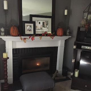
Let's fall into Fall....

Now that fall has arrived, we start to think cozy and warm.   How great does cuddling up on a sofa http://www.arhaus.com/furniture/living-room-furniture/sectional-sofas/ on a cold night  sound?     You can have a very cozy space without bringing all that clutter you removed for a laid back summer, back into your space.  

Image result for images of cozy fall roomsImage result for images of fall rooms
courtesy of Country Living
Adding layers can warm up the area.  We need to realize that our homes are a 
reflection of our own personality so we should not be completely devoid of personal items.


How can we have a warm, cozy and inviting space without looking so cluttered you 
do not feel relaxed?  A little knowledge of a couple of the basic design principles can 
help guide you to create a fabulous cozy home.

The use of color creates an emotional atmosphere and should complement 
 the design. Darker shades, high intensity colors and warm hues have more weight 
than lighter shades, cooler hues and low intensity colors. This in turn creates the 
“feeling” of cozy and warm. 

Color works magic by communicating with our emotions.  It creates an emotional 
atmosphere and should compliment the design. Color inspires, energizes, soothes, 
and enlivens.  See how switching from a cool color scheme to a warm scheme 
changes the mood of a living room. This can easily be done with cushions, throws, 
candles and floral arrangements.  Even the most modern space can be “cozy” in 
fall/winter by adding just these few elements.  Perhaps a new area rug in a darker 
hue for winter.  Books always add a wonderful feel to any room.


courtesy Design Savvy

Texture plays an important part in creating a cozy atmosphere.  Think of a nubby or 
faux fur throw.  Add some really soft cushions. Texture is essentially a tactile 
characteristic, but may be perceived by either touch or sight. Texture may be rough, smooth, 
bumpy, fuzzy, grooved, or prickly. Tactile texture is felt, while visual texture is seen, imparting 
impressions of textures. Visual texture is often referred to as pattern. A pine cone has a texture
one can feel as well a pattern one can see. Texture can be used to create different feelings in 
an environment—smooth textures seem cold and impersonal while rough textures seem warm 
and natural. 

This fall I will change up the throws, toss cushions, area mats, candles and some decor
items to warmer colours with more texture.  I will add bowls of pine cones, containers with sticks, and any fall like decor items I find,  I think books are a great addition to a space at any time of year, however in fall and winter they add to the layered and cozy look, not to mention that we are indoors more in the fall and winter thus  offering time for more reading. candles will be scented cinnamon and apple which conjures up a fall cozy feeling.  My rattan mats will be rolled up and replaced with woven, patterned mats. 


  courtesy Design Savvy

        Image result for images of cozy fall roomsImage result for images of cozy fall rooms

        courtesy house beautiful


Of course, it alll starts at the front door!


courtesy Design Savvy

Wednesday, August 31, 2016

Every year the various paint companies select a 'colour of the year'.  This year for 2017 Sherwin-williams has made the first announcement.  We will be hearing from the other companies later and then the Pantonne Colour of he year will be introduced near the end of 2016. What do you think of Poised Taupe as the SW colour of the year?
Sherwin-Williams has announced Poised Taupe as the 2017 Colour of the Year.
“Poised Taupe celebrates everything people love about cool grey as a neutral, and also brings in the warmth of brown, taking a colour to an entirely new level. Not cool or warm, nor grey or brown, Poised Taupe is a weathered, woodsy neutral bringing a sense of coziness and harmony that people are seeking,” says Sue Wadden, director of colour marketing for Sherwin-Williams.
As the Sherwin-Williams team attempted to make this year’s selection, it became clear that neutrals are beginning a transition from the monochrome grey of the past five years to a more complex taupe and brown. In a recent homeowner survey conducted by Sherwin-Williams, nearly 40 per cent of the respondents agree that they would like to incorporate warmer neutrals, such as warm greys, taupes or beiges, into their home décor. Additionally, more than two in five people identified taupe as a timeless neutral they would choose.
bedroom.jpg
“Consumers yearn for spaces that feel welcoming and hug them as they enter. Earthen brown combined with conservative grey, creating Poised Taupe, embodies all of these emotions,” says Wadden.
In 2017, the subtle shift to warmer colours reaches commercial spaces too, which tend to move in more conservative colour cycles than residential or designer directions. Influences such as natural or organic materials, weathered and worn finishes and global cultural preferences have suggested alternatives to the primarily grey existence that has been the star of commercial colour direction over the past five years.
bathroom.jpg
“Since commercial colour direction tends to enjoy longer life cycles, Poised Taupe is on the forefront of this trend, offering the ability to endure over time, yet complement a wide range of designs,” says Wadden.
Aligned with this burgeoning trend of moving away from the stark, cold and barren commercial environments, Poised Taupe gives developers, builders and interior designers a warm colour that offers dimension and complexity, but is neutral and subtle to work with for nearly all aesthetics.
https://www.canadianinteriors.com/interior-design/sherwin-williams-taupe-2017/1003737785/

Thursday, May 19, 2016

Spring has Sprung

I haven't been writing for a while as the design business has been busy, however today offers some time.  As I look out to the beautiful sunny day I really feel that spring is finally here.  As we approach a long weekend many will be opening pools, going to open their summer homes or purchasing and planting our summer flowers and tending to our gardens.  As soon as it is possible I am outside with a throw and some heat, enjoying the outdoors which comes and goes much too quickly for my taste.  As we have been cooped up indoors it is a welcome change to be outdoors.  My own deck awaits me.

As we freshen up the outdoors we need to think of inside our homes and freshen them up as well.  I like to change up my colour scheme with accessories.  You can put new cushion covers on your toss cushions; change up your throws from heavy to something light and bright. This the time to take up any heavy and dark area rugs and mats and perhaps replace with summery sisal ones.  Pull back any heavy draperies and let the sunshine in. Wash and open your windows for some fresh air. Bringing in some flowers adds to the summer theme.

Monday, March 21, 2016

So You Have Decided to Hire an Interior Decorator… Now What??

After you have made the decision to hire an Interior Decorator for whatever project you are undertaking, you will now be asking yourself and the decorator – what now?

  • The decorator can take over the entire project from start to finish.  They will do up a floor plan, source furnishings, fabrics, window coverings, paint samples, arrange for trades to do any work involved and present this to you for your input and approval.  It will also be the responsibility of the decorator to act as the project manager.  This method works well for those who do not have the time to go about the business of “sourcing” and “managing the project with trades”.
  • Another method of working with a decorator is more hands on for the client. If you have the time and wish to be involved in the sourcing, etc. you can pay your decorator for their time to take you to different suppliers, especially those which are “trades only”, where you are able to find items which are not available through retail available to you the consumer.  Your decorator can either arrange for trades or offer you some options, or you may in fact have someone you wish to use.
  • A third alternative is to have the decorator compile a selection of ideas for the space along with some samples and retail sources available to you, and then you can in turn,  take it from there.  This method works especially well with the “Do-it-Yourself” type client; someone who enjoys the entire project and wants to tackle it themselves, however they may require a little professional guidance from the decorator.
The above are only three ways of working with an Interior Decorator.  Everyone has their own business style.  The most important part of this entire process is to find someone you feel comfortable with; someone who listens to you and your ideas; someone who respects what you have to say; and can understand the type of look you would like, even if you cannot actually verbalize it in “design speak”; and ultimately someone who can offer cost effective alternatives to décor solutions.  After all, this person will be re-creating your personal space,  which will be a reflection of you, so it really is essential to have a “good fit”.

There are many different approaches to working with a decorator.  You, the client, should have continuous input and, in the end, the final say.

Usually when you first contact a decorator there are questions asked about the type of project you are undertaking, the scope of it, with discussion relating to your preferences, lifestyle, and ultimately the cost involved along the way.

Your decorator will discuss their fee, which is usually an hourly rate or depending on the type of undertaking, could be a total project rate.  For example, if you were having an entire basement renovation and finishing, there could be a project fee based on the total amount of work involved.  For obvious reasons, this is best discussed at your home when outlining the scope of the project. Having discussed fee, the next step is an in home consultation for which payment of said fee is due at the end of the consult.

Now comes setting up a meeting at your home with the decorator.  Many decorators offer the flexibility of evenings and weekends, however you may be required to meet during the daytime, much as you would if you had a repair person coming in or if you were going to the dentist.  This is something based entirely on your decorator’s schedule and method of work.

At the time of the consultation the decorator will sit down in your home with you and discuss your plans.  If you have ideas, these will be noted along with a brief outline of what ideas the decorator may be able to put forth at this initial meeting.  Depending on how much work is to be done now or in the future, the decorator should also be taking a walk through your home to get a feel for your lifestyle and how you use your space.  This is particularly important so as to be able to mesh the newly decorated space with the current surrounding spaces. 

Ultimately an Interior Decorator can take you from discussion and ideas through space planning, sourcing furniture, fabric, floor and window coverings, accessories and art, paint selection, kitchen and bath plans & renovation ideas, appropriate lighting, contracting trades, to managing the project.  You have the choice as to which part of their expertise you can utilize!
  
Your decorator will give you ideas of their own on how to approach any project.  Depending on your budget you do have much flexibility here. 


Monday, March 14, 2016

How do Interior Decorators create that perfect space?

There are many variables involved – the correct use of colour, textures, lighting along with space planning and creative furniture placement, in order to maximize rooms to their best potential. 

Colour and lighting; whether natural or artificial can impact on how we feel in the space.  By using cool or warm hues we create a feeling for the space.  A variety of textures add interest and depth to the space.  There is no right or wrong opinion about neutrals vs. colour; it’s all a matter of applying the colour in an appropriate manner.

Decorators are able to create functional yet fabulous designs, both being equally important.  A decorator can lend that polished look, with attention to details, creative lighting, custom millwork and window treatments.

A decorator creates innovative designs, manipulating the scale of furnishings and prioritizing features for both function and style, especially in small spaces.  A decorator can transform your space into the dream you have always envisioned. A decorator can take your ideas, make suggestions and in the end transform them into a perfect space.

An Interior Decorator can offer a full range of residential design options such as Color Consultations, Space Planning, Furniture Selection, Custom Draperies and Soft Furnishings, Flooring, Wall Coverings, Kitchen and Bath Planning, New home specifications and preparing the home for Resale, as well as Selection of Artwork and Accessories.  A decorator can assist in the Refreshing of a room by Repurposing and Repositioning pieces to create a new look.

There is great deal of flexibility when working with an Interior Decorator.
A decorator will work with you to develop a decorating plan and establish a realistic budget.  Any project can be broken down into manageable pieces to be completed at a later date.

Ultimately an Interior Decorator’s job is to add the icing to the cake.


Tuesday, March 1, 2016

Countertops 101

When selecting a countertop for our kitchens or baths we can become overwhelmed by the selections available and which work best for us individually.  If you want low maintenance you would not go for marble.  For the low maintenance crowd, quartz is one of the best products available.

Solid Surface
The generic term, ‘solid surface’ refers to any material that is solid all the way through. This means it doesn’t have a topcoat that is different from the centre core. Solid surface materials are consistent in colour and content throughout. The advantage of this can be durability, hardness, temperature dispersion and edge profile options. Marble, Quartz, Granite and Corian (or similar materials like Gibraltar or Zodiac) are all considered Solid surfaces.

Plastic Laminate
Plastic Laminate‎ is a thin plastic sheet moulded around a particleboard centre with a few options for edge detail. This is not a solid surface material. Although not loved by designers, real estate agents or homeowners alike, laminate can be a practical and inexpensive solution in certain spaces. Also, laminate companies continuously coming out with new colours colours and options. This is the most affordable option.

Corian
Corian is a man-made resin product that comes in multiple colours. Corian is well known for its integrated sinks and seamless joints. Less glossy than quartz or natural stones, it has a softer look and feel. An advantage to Corian is that it can have adjustments made to it such as extending a counter top without removing the top or creating seams. ‎Corian is an easy to maintain pliable material with a premium price tag!

Marble
As beautiful as Marble is, one must be careful when selecting it.  It stains very easily so in a bathroom it can become damaged by some of the chemicals used.  When used on a kitchen countertop it requires maintenance but as it ages, it is beautiful.  If you want the look but not the maintenance, think about using it for your backsplash. The reason being, it can be very sensitive to wine stains or de-glossing from lemons, tomatoes or vinegar. A matte or leathered-finish marble can be slightly more forgiving, but it’s only for customers who can handle the natural marking that will occur. If you can’t handle this, choose something else!! Marble is expensive, beautiful but sensitive!!

Granite
Granite is a different natural stone than marble, in the fact that it is impervious to wine, acidic food and most scratches & wear and tear. ‎(Hence tombstones are now granite and no longer marble!). Granite has more of a pebbled pattern and less veins than marble. .
  
Quartz
Quartz is the generic term used to describe a man-made material formulated from the quartz found in granite and then recast in resin. It is very hard, non-porous, scratch resistant and nice looking. It is softer in pattern than granite, but it is not as reliable for heat dispersion. You may want to stay away from quartz around fireplaces and try not to rest hot pots on it. Quartz is a good choice if you want a variety of colours or lots of companies to choose from. It costs about the same as granite.

Soapstone
Soapstone is new to the solid surface lineup, although it’s been around for a long time. It is naturally heat resistant and easy to maintain. You can have integrated sinks, with soapstone, included within the counter top. It is less glossy than marble or granite and offers a variety of pattern, but always in a dark tone. It is an excellent material for dispersing heat so it’s perfect around fireplace openings or in high-wear kitchens. Soapstone is the same in cost as high-grade granite.

Quartzite
Often confused with the name quartz, quartzite is a natural stone that has the durability of granite, but the veining pattern of marble. It is a delicate material during manufacture, so it requires a good fabricator. Once it is installed, it performs well. Slabs generally have soft wave patterns in a full range of largely neutral colours. You can expect premium pricing with Quartzite.

Butcherblock
Butcherblock countertops are a breed of countertop all by themselves. They offer the aesthetic warmth that the look of wood provides while at the same time providing a versatile work surface in the kitchen. They bring a distinctive look that's appropriate in a kitchen that's hard at work or "dressed up" for entertaining.
Deciding whether it's the right choice for your kitchen takes an understanding of just what a butcherblock countertop is, how it's made and how you're going to use it.
Remember that butcherblock counters that you will cut and prepare food on will need frequent cleaning and oiling. If you're someone who just isn't up for this level of maintenance, consider getting "non-working" butcherblock countertops and use a separate cutting board for the food preparation. If you neglect the cutting board, you can just toss it out. That's harder to do (and more expensive) when you've neglected your countertops.

Concrete
The decision about installing a concrete countertop versus granite, marble, corian or laminate can be a difficult one.  When thinking about this keep in mind you will need the correct cabinetry infrastructure to handle the weight so putting concrete on 30 year old cabinets may not be the best idea.  Concrete is both beautiful and budget-friendly. If properly installed and sealed, concrete countertops will last practically forever. Colncrete works well in a modern or industrial looking kitchen.  Concrete is a poreous material and will absorbe liquids and stain.  Acidic substances will etch the concrete and cooking oils can leave dark stains.  Applying a sealer to the surface will lessen the chances of damage.

Monday, February 22, 2016

Outdoor Living - Creating your Outdoor Kitchen

Creating your Outdoor Kitchen

When we think of an outdoor kitchen we should think about our indoor kitchen.  What do we like or not like about the indoor kitchen which can be related to how you create your outdoor kitchen.  An outdoor kitchen takes a lot of planning.  You need to think about many factors including the type of cooking you will do – charcoal, smokers, pizza ovens, gas/propane and then the other aspects; chilling – will you want a refrigerator, ice makers, water, counter top for preparation, bar, seating, and storage.

Ultimately the look is important and how all of the elements fit together and of course your budget. As in creating your indoor space, you should select one element/area to be the focal point and build around it.  Keep in mind the following – Fence lines and setbacks; the type of greenery; lighting, landscape currently in place; accessories.  Also keep the location of your barbecue so that the smoke does not drift into the seating area.  Don’t block views when you select your location as the view and surrounding floral and greenery add to the ambience.

Create this outdoor space with attention to details and incorporate appropriate furniture.  Will you have a roof over your kitchen? What type of flooring will you want?  Think about your indoor kitchen and try to incorporate some of the best features of it to your outdoor kitchen. 


The addition of the outdoor kitchen and appropriate sitting area to your home will give you many years of enjoyment.  Outdoor kitchens, when done right can add to the value of your home.

Friday, February 19, 2016

Outdoor Lighting and AV

Outdoor Lighting and AV

A great presentation by Moonstruck Lighting left me incredibly inspired.  A beautiful garden is lost at night without proper lighting.  There was a lot of technical information but I will focus on general information that will help you when lighting your outdoor space. LED has come a long way and you no longer are limited with the cool blue light. 

When you decide to light your outdoor space there are factors to consider that will affect the performance.  Look at the surfaces you wish to light; is there texture; is the finish smooth; or is there colour?  Lighting will direct the eye to where you wish it to go. Something many people may not realize is that you require a permit unless the lighting is self-contained or low voltage plug in.
There are many lighting techniques; some of which I will describe.  

Up lighting is the most common which provides a focal point.  When lighting a large tree it is more balanced if you have three lights around so it doesn’t look flat.  

Try down lighting on floral plantings while angle lighting is very effective on textured materials.  

Path lighting is usually no more than 18” and is a safety option.  When lighting stairs try lighting from above so you do not have the shadows presented if you light from below the step.  A very beautiful technique is to light water and sculptures.  Some other types of lighting include shadow lighting, silhouette lighting; sign lighting but one of the most important lighting options is to have light that highlights your house numbers.  Overall it is better to have several types of lighting rather than only one very bright source.  It is important to have balance in your lighting system.
In the end it is important to consider hiring a professional to do this for you as they have the skill needed to create a favourable lighting scheme for your home.

Outdoor AV has become much more mainstream these days as people are using their outdoor spaces for longer periods of time.  They are now the outdoor version of the living/dining room.  There are a full range of outdoor speakers available that can be hidden among your plantings for a better ascetic.  You can have one full range speaker or component speakers spreading the sound more evenly.  There are now outdoor Televisions available that are waterproof; have anti-glare glass and some have a built in fan or heater.  When you get into a sophisticated system it is best to consult with the professionals.

Wednesday, February 17, 2016

Outdoor Living - Outdoor Fabrics

If you follow this blog you will have read my first entry about outdoor living.  Now I want to focus on outdoor fabrics.  Barb Nyke, a colleague of mine presented some fabulous information.   I would like to share.some of what I learned at the conference.  I have many pages of information but will focus on the major issues.

We all have heard of Sunbrella, however that is not the only product available to be used successfully outdoors. Outdoor fabrics should be high performance and offer the following factors -
durable, water resistant, water repellent or waterproof, stain resistant, mildew resistant, colourfast: which means they will have UV resistant pigments.

We use outdoor fabrics in many ways - awnings, umbrellas, cushions, shade sails, flooring and marine.  One of the great factors is that nowadays this fabric is not stiff and can easily be used indoors.  In fact it is difficult to tell indoor from outdoor in many cases.

Fabric content can be  Polyester (good); Olefin (better) and Acrylic (best).  All three are appropriate with there being some differences.

The type of foam is very important.  If one used regular foam the water would sit on top and cause mold to form.  Using a marine grade allows for water to penetrate and drain out at the bottom, thus no mold.

There was a lot of technical information shared by Barb and I am just giving you an overview  so you have some basic knowledge when sourcing your outdoor furnishings.

Enjoy your summer when it gets here!

Thursday, February 11, 2016

Gresham House Furniture

This morning I had the opportunity to visit and take a tour of the Gresham House showroom and workroom where all of the beautiful furniture is made.  They create everything from sofas, sofa beds, ottomans, chairs, headboards, bed rails and so on.  Yes, it is Canadian made hardwood with all of the very best in construction as well as fillings.

It starts with Canadian hardwood which is corner blocked, dowelled, screwed and glued.  Sinuous springs and web and coil are offered.  The arms and backs are padded with cotton felt and green soya foam to offer comfort that lasts.  A single upholsterer works on each piece individually from start to finish. 

The seat cushions are made with eco friendly foam, soya, which is extremely durable and is wrapped in a soft fibre channeled so that it won't move around, and finished in a cotton casing to ensure futher durability. It is much nicer if one opens the outer fabric to see a nice white casing rather than just the foam.  


If you prefer feather cushions, for their luxuriousness, there is a feather blend.  100% waterfowl feather wrap for seats with a foam core and 60% waterfowl feather, 40 % fibre for the backs.  The ultimate in luxury is down fill (20% down, 80% waterfowlfeather in the backs and enveloped wrap on seats.


Each piece is hand cut individually in order to ensure that patterns are matched and then passed to the sewers.  The sewers do their part and then it is passed to the upholsterer who as mentioned earlier does the entire piece.  When sewing, the piping is cut on the bias for a better look and fit.


Tuesday, February 9, 2016

Outdoor Living

Last week I attended a wonderful and educational two day conference on Outdoor Living at SOFA which was filled with a plethora of valuable information.  The venue was filled with designers, decorators, landscape and gardening professionals all interested in learning more about the ever growing area of Outdoor Design.    Outdoor spaces have come a long way from some folding chairs, a picnic table and hibachi.  We want to extend our time enjoying the outdoors and do it in the same comfort at our indoor spaces.  Many of the outdoor ‘rooms’ rival our indoor rooms.  Not only do these outdoor rooms add to our enjoyment but, if done well,  they add to the time we can spend outdoors.  We are so lucky to have so many options available nowadays and so many professionals who focus on this valuable added space to our homes.

Why create an outdoor space?  It can extend the time we have outdoors; it can increase the value of our homes and, add to our general wellbeing by offering a place for relaxation without the usual distractions found indoors; such as promoting communication when sitting around a fire.  We live in such a fast paced world it is just nice to venture outside and spend time doing nothing.  It becomes a retreat.

Where do we start to create this space?  To build a successful outdoor space many factors must be considered.  The very first thing to consider is how you want to use the space.  What is essential to your needs and wants? Is it for relaxing or entertaining?  How much time do you want to be outside? You then need to have a ‘space plan’ just as you would when designing your indoor space.  This helps with dividing the different outdoor rooms you will create.  Think about how you will enclose the space – fences or shrubs and how you will create privacy.   

Let’s consider the following elements -

Heating - There are many heat sources available and of course checking with your individual municipality by-laws is crucial before thinking of any type of fire.  Fireplaces, both gas and wood burning; fire pits or fire tables, electric heaters are all available.  Do you have a safe area on your property to have a live fire?

Cooking – Barbeque grills, wood-fired pizza ovens, bars, a complete outdoor kitchen which could include a refrigerator, sink, grill, storage cabinet, etc.

Seating – Do you want a place to eat and have dinner parties?  Then a table and chairs will be on your list. Do you like to relax and read outside or sunbathe? Lounge chairs and sectional seating have become very popular.  In fact some of the outdoor furniture seating arrangements are very similar to those we find inside.

Flooring – Will you have a deck or porch? Perhaps brick, stone, slate, stamped concrete. There are so many options available and depending on your property size and grade a professional will help you in making the best selection.

Landscape Materials and Plant Materials – this is where it is in your best interest to consult with the professionals on how to best add soft and hard surfaces to your property
Water – will you want a swimming pool, hot tub, pond or waterfall?

AV – Many of us want to listen to our music outside.  There are a full range of speaker options available which can actually be hidden within your plant material for a clean look. Some people desire an outdoor television which is available but, be sure to purchase one that is waterproof and has an anti-glare surface.

Shelter – will you want a covered porch, a sunshade, gazebo, sunroom or will an awning or umbrella be sufficient?

Lighting & Accessories – as is the practice for indoor decorating, the same principles hold for outdoors.  Lighting is one of the most important features for your space.  We see many types of pathway lighting and of course you can hire a landscape designer who will assist in offering you many other options.  Lighting can highlight certain features in your garden – deck, path, shrubs, fountain, pool, steps and so on.  Accessories are the fun stuff – garden sculptures, tabletop décor items, area rugs within the seating area.

By working with the professionals you can achieve a completely wonderful and useful outdoor living space.


                      Stay in touch for more information and images on outdoor living.

Tuesday, January 26, 2016

Let’s go “shopping”….. at home!


You have decided it is time to give your home a new look but your budget just isn’t up for a complete makeover.  In times of tight budgets, not to mention all the attention to the four “R’s” – Reduce, Re-use, Recycle, Re-invent - it can be fun to “shop in your own home”.  You probably have many good pieces that can be re-purposed. Home Re-styling without Spending Money is a great way to redecorate a room.

Pick the room that needs a makeover.  Look at the space carefully; decide what you like about the room the way it is now, and what you would like to change.

The next step is to take pictures of your room and you will see it in a totally different way.  Any flaws will stand out right away and this will assist you in your makeover. Be objective.

Now remove everything from the room including pictures and wall art.  If painting is on the agenda go ahead.. You have a blank slate to work with.

When you have a general idea of how you want the room to look, decide what stays and what goes.  Remove any pieces of furniture that will not fit in with your new design. For example, if you’ve decided on a more sophisticated look, the country style pine pieces will not work in the new design. Make a list of what needs to be done to make the room look the way you have visualized it.

You are now ready to go “shopping.”  From the list you made, walk through the other rooms of your home and go through stored items to see what will be useful to you. To save yourself time and effort, measure any potential furniture pieces to see if they will fit in the intended space in the room you are redoing.

Once you have prepped the room and chosen the furniture pieces that will stay and the ones that will be moved from the other rooms of your home, you are ready to place the furniture. View the room as you would like to use it, and keep in mind what worked in its former set up.  Before you start moving around furniture, draw up a floor plan on paper to decide where you want each piece to go. 

Take into account any pieces of furniture that need to be near a power source like the end tables or the TV stand. Also, take into account the room’s traffic flow, heating vents, etc.  Your room must not only look pleasant but it must be functional.

When everything has been placed in the room according to your plan, including decorative items rescued from other parts of the house, you are ready for the fun part – adding the finishing touches. You don’t want to spend very much, so prioritize the items you want to add. New accent pillows, decorative candles and picture frames don’t have to cost much if you get them on sale. Make a list and stick to it. The whole purpose of the exercise is to give your room a new look – you don’t want to end up spending a fortune.


Wednesday, January 13, 2016

Accessories and Lighting…..

Accessories and lighting are two of the most important factors in good design.  A space can be completed with the best furniture, however without the correct lighting and some well-chosen accessories, it is flat and without personality. Think of the accessories as the jewellery we add to a nice outfit.  When pairing our ‘jewellery’ to our outfit we keep the proportion and theme consistent.  The same goes with accessorizing your home.  It is more than just adding tshotchkes and some wall décor at the end of a project.  It’s about well thought out design details that are put into the plan before completion.  After all, finishing details are what make a well dressed home.

Too often with decorating projects, available funds are allocated to large-scale furnishings.  Necessary to be sure, however, in my experience the ultimate satisfaction doesn’t arrive until the finishing touches are firmly in place.  I suggest that you save 20% of the total budget for styling and accessorizing.  If you do not allocate money to cover the cost of accessories, you will end up with a space that’s completed but devoid of character: lackluster and disappointing.

A room is boring and bland without the embellishments.  It’s the extras that bring a room to life and make it warm and welcoming.    Accessories transform a space and inject it with character.  They should also be representative of your own individual personality and perhaps reflect your interests and travels.

Lighting is the other important factor in creating the perfect atmosphere in your home.  It offers functionality as well as mood.   For the most effective lighting scheme, you need a combination of all three types of lighting, comprised of task, ambient and accent.  The ambient light will provide a general even balance of light throughout a space such as a chandelier.  Task lighting will focus on a specific area such as a lamp positioned for reading.  Accent lighting will draw attention to a particular area and add depth and drama, such as a picture light or a recessed pot light directed toward a piece of art.

When planning your overall lighting you need to consider the mood you want to create and the tasks to be performed in each specific room.  When selecting your fixtures, obviously you would want to compliment the style of your room’s décor.   The type of lampshade can also affect your lighting.   The shape, material and opacity of the shade will affect the direction and diffusion of the light by sending it up or down and reducing glare.  Using dimmers gives you more control over the brightness and mood. 

When planning your lighting, it is important to speak with expert lighting suppliers in order to be certain that your final plan will serve your needs.


Accessories complemented with lighting!

Monday, January 11, 2016

Colour - Go for it!

“Colour is like food for the spirit – plus it’s not addictive or fattening” says Isaac Muzrahi


2016 color trends bring an abundance of variety to suit everyone, even the diehard neutral lovers.  Our Colour of the Year is actually two colours - Rose Quartz and Serenity which are soft pink and blue.   In looking forward to spring we think in color, so it only makes sense to add some of that refreshing color to our homes.  Colour trends in interior décor tend to follow those of fashion runways and this spring/summer is no exception with both fashion and decor very colorful.
Colour is a fundamental and important design element.  When used properly, color provides cohesion of design, and, color themes can evoke different moods or a tone to a room.

Linking rooms enhances any space. If rooms have good color transition and correlation, they have a smooth & harmonious flow. It is essential to create a flow in a house with an open floor plan or one in which rooms connect through wide openings, by choosing colors that relate to each other in a pleasing way. The challenge is to give each space its own identity according to its function and still achieve a feeling of unity. The connection can be as subtle as a recurring color in the fabrics, accessories and furniture in each room, transitioned with wall colors that are closely related and similar in value and intensity. Using unrelated colours in adjoining rooms can make the house feel like a disjointed series of spaces, while colours that relate to each other draw the eye from one room to the next and create that pleasing flow.

Colour affects our emotions and the effective balance of color will provide a harmonious setting, which in turn creates a pleasant “feeling” in the space. Decide on how you want to “feel” in the room - calm or energized, intimate or open, dramatic or playful; the use of different color will promote this “feeling or mood”.  It is also important to look at another factor when selecting colour.
                                                                                                                                    
Lighting is one of the most crucial elements when selecting color.  The room’s exposure; type of light – direct sunlight, indirect sunlight or artificial light; and time of day you will most likely use the room; play a part in your decisions.  Since colour changes when viewed under different light sources, paint and accessories should be viewed in the actual space and lighting where they will be used.

The use of color is the easiest way to transform a room.  This can be done with paint, wallpaper, tiles, fabric, flooring, art & accessories.  Paint is one of the least expensive ways to transform a space. Though more costly, wallpaper has made a large comeback this season, with contemporary, simple patters and graphics.  Colourful accessories can add impact and freshen up a room without breaking the bank. When a space requires a sprucing up, color, no matter where applied, can make the largest impact.

The use of color does not mean you cannot have a neutral pallet. Adding a dash of color to the already neutral palette gives the room a new look and this color dash can be removed at any time.   Keeping large items such as sofas, chairs and draperies neutral and enhancing with colored toss cushions, accessories, lamps, art, etc. adds style to your space.  These small items can be changed by season, or as you tire of them, without great expense.

One of the first things most interior designers will tell you when it comes to color is to determine the paint for your walls AFTER you have selected the more expensive pieces in the room. The reason is simple, always match the paint to the furniture. Paint is one of the least-expensive decorating elements in a room and can be easily altered and changed as needed.  There are more colors available in paint than any other medium available. 

The best way to establish a color palette for your home is to have a starting point or inspiration piece, a painting, carpet, pottery chair, from which to draw out the color. Look for a pattern that appeals to you. Use that inspirational piece and break it down in terms of color “priority" to create your scheme.  Ultimately, select in the color family that appeals the greatest to you, while keeping in mind all the other factors involved – mood, lighting, theme - when making this selection.  Most Important – Have Fun!


Friday, January 8, 2016

Fun in Niagara on the Lake

Cooking class with Jason Parsons

 Wine Tasting - Yum!
 Ice Room at Pellar Estates Winery

SOFA - Universal Design

  1. "Universal design makes things more accessible, safer, and convenient for everyone. Also called "Design for All" or "Inclusive Design," it is a philosophy that can be applied to policy, design and other practices to make products, environments and systems function better for a wider range of people. It developed in response to the diversity of human populations, their abilities and their needs." - The Center for Inclusive Design and Environmental Access   www.universaaldesign.com
  2. "Universal Design ("UD") increases usability, safety and health of environments, products and systems in response to the diversity of people and abilities. With attention focused on the changing demographics, differences in functional ability and preferences are part of everyday life experience. UD represents a paradigm for design of the built environment and products to address this diversity and increase use by all by introducing flexibility, choice and accommodating features to the physical world and business practices." - ThUniversal Design is an evolving concept, and as such, different people have slightly different definitions. We gather here some definitions from leading Universal Design experts and organizations. e Global Universal Design Commission
The 7 Principles of Universal Design were developed in 1997 by a working group of architects, product designers, engineers and environmental design researchers, led by the late Ronald Mace in the North Carolina State University.The purpose of the Principles is to guide the design of environments, products and communications. According to the Center for Universal Design in NCSU, the Principles "may be applied to evaluate existing designs, guide the design process and educate both designers and consumers about the characteristics of more usable products and environments."  
The seven principles of Universal Design are as follows:
  1. Equitable Use: The design is useful and marketable to people with diverse abilities.
  2. Flexibility in Use: The design accommodates a wide range of individual preferences and abilities.
  3. Simple and Intuitive Use: Use of the design is easy to understand, regardless of the user's experience, knowledge, language skills, or current concentration level.
  4. Perceptible Information: The design communicates necessary information effectively to the user, regardless of ambient conditions or the user's sensory abilities.
  5. Tolerance for Error: The design minimizes hazards and the adverse consequences of accidental or unintended actions.
  6. Low Physical Effort: The design can be used efficiently and comfortably with minimum fatigue.
  7. Size and Space for Approach and Use: Appropriate size and space is provided for approach, reach, manipulation, and use regardless of user's body size, posture, or mobility.
Principle 1: Equitable Use
The design is useful and marketable to people with diverse abilities.
Guidelines:
1a. Provide the same means of use for all users: identical whenever possible; equivalent when not.
1b. Avoid segregating or stigmatizing any users.
1c. Provisions for privacy, security, and safety should be equally available to all users.
1d. Make the design appealing to all users.
Principle 2: Flexibility in Use
The design accommodates a wide range of individual preferences and abilities.

Guidelines:
2a. Provide choice in methods of use.
2b. Accommodate right- or left-handed access and use.
2c. Facilitate the user's accuracy and precision.
2d. Provide adaptability to the user's pace.
Principle 3: Simple and Intuitive Use
Use of the design is easy to understand, regardless of the user's experience, knowledge, language skills, or current concentration level.

Guidelines:
3a. Eliminate unnecessary complexity.
3b. Be consistent with user expectations and intuition.
3c. Accommodate a wide range of literacy and language skills.
3d. Arrange information consistent with its importance.
3e. Provide effective prompting and feedback during and after task completion.
Principle 4: Perceptible Information
The design communicates necessary information effectively to the user, regardless of ambient conditions or the user's sensory abilities.

Guidelines:
4a. Use different modes (pictorial, verbal, tactile) for redundant presentation of essential information.
4b. Provide adequate contrast between essential information and its surroundings.
4c. Maximize "legibility" of essential information.
4d. Differentiate elements in ways that can be described (i.e., make it easy to give instructions or directions).
4e. Provide compatibility with a variety of techniques or devices used by people with sensory limitations.
Principle 5: Tolerance for Error
The design minimizes hazards and the adverse consequences of accidental or unintended actions.

Guidelines:
5a. Arrange elements to minimize hazards and errors: most used elements, most accessible; hazardous elements eliminated, isolated, or shielded.
5b. Provide warnings of hazards and errors.
5c. Provide fail safe features.
5d. Discourage unconscious action in tasks that require vigilance.
Principle 6: Low Physical Effort
The design can be used efficiently and comfortably and with a minimum of fatigue.

Guidelines:
6a. Allow user to maintain a neutral body position.
6b. Use reasonable operating forces.
6c. Minimize repetitive actions.
6d. Minimize sustained physical effort.
Principle 7: Size and Space for Approach and Use
Appropriate size and space is provided for approach, reach, manipulation, and use regardless of user's body size, posture, or mobility.

Guidelines:
7a. Provide a clear line of sight to important elements for any seated or standing user.
7b. Make reach to all components comfortable for any seated or standing user.
7c. Accommodate variations in hand and grip size.
7d. Provide adequate space for the use of assistive devices or personal assistance.   http://universaldesign.ie/What-is-Universal-Design/The-7-Principles/