Showing posts with label Kitchen Products. Show all posts

Wednesday, March 1, 2023

2023 TRENDS IN KITCHENS - THE HEART 0F THE HOME

A lot of what we see has been around for a little while in some cases and a long while in others but the kitchen is heating up in 2023.

Islands are taking on different shapes and colours. We see stools either facing each other or along one side and around the end so you can sit and talk easier than just all in a line facing one way.  Islands continue to be at times a different material or colour as well as the countertop than the perimeter cabinetry. Many islands are completely different from the perimeter and are free standing and look like furniture pieces, some are rounded at one end. Islands are available that are made of different material than the perimeter cabinets.  They can look like a piece of furniture and some can even be moved.

Perimeter cabinetry can be two different materials between the upper and lower, also incorporating a mix of a painted surface and a natural wood for interest. Open shelving continues but you need to be very tidy or it will drive you nuts if everything is messy. The white kitchen will always be popular and in style, as well as a gray, but many of us have wanted to change to more dramatic cabinet colours like deep Green, Navy, Charcoal and even Black. To achieve a kitchen with colour without going too intense we see greyed blues and greens.

When renovating a kitchen it seems that everybody wants an island and the bigger the better. In reality not every kitchen has the needed space for an island when considering the rest of the kitchen.  You need space to open cabinet doors/drawers, appliances nearby and of course stools. There is a resurgence of the kitchen table in the middle of the room much like what we would have seen long ago before the island invasion. Tables can work for meals but also for prepping and other tasks. Many people select a table that is counter height with stools.

Some popular styles are - Modern rustic style – Natural wood and natural stone

Elegant farmhouse style shaker style cabinets still very popular, apron sinks, stone  backsplashes 

Modern Spanish style – terra cotta floor, island with butcher block, hand painted backsplash tile

The opposite to going dark and dramatic are the warm and soft palettes – Natural light wood cabinets, bronze and brass, light flooring such as a white oak. Wood can live well in a kitchen 

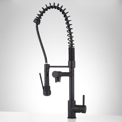
Some of the changes are Commercial style faucets, hands-free/touchless faucets, workstation sinks which have a professional look, and include straining, chopping, drying etc. in a variety of sizes. Again the apron or farm sink and faucets can be stainless, fireclay or now there copper options, oil rubbed bronze. Many kitchen renos add the pot filler over the range. Wine fridges and refrigerator drawers are gaining popularity. 

Induction cooktops - are becoming more popular as they cook quicker and more evenly. They heat up the cookware rather than the stovetop which also is more energy efficient.  Many types of pots and pans can work, however its best to check your cookware with the options that will work.

I could go on and on about all the amazing kitchen options available but this short post gives you the ideas to start thinking about a kitchen change even if only a small update.

Good lighting is very important in every room, but even more so in a kitchen.  There are so many options available that would be another post.


Dark base cabinet with shelving rather than uppers

Dark wood perimeter cabinets with white waterfall island
Light pastel blue/green cabinets with wood flooring
White perimeter cabinets with dark wood island

Dark blue/navy white countertop

Green lower cabinets with white uppers and white peninsula

Charcoal cabinetry with furniture style wood island

White with freestanding island with shelving


Rounded end of island with seating facing across and the eating portion lower

Farmhouse/modern rustic style featuring wood beams

Natural wood cabinets with wood ceiling beams

Matte black commercial style faucet

Hands free/touchless faucet

Pot filler


Different materials for Farm/Apron front sinks


Tuesday, May 12, 2015

Inspiration: 7 Kitchens with Bold Backsplashes

A guest post by Jane Blanchard -

Inspiration: 7 Kitchens with Bold Backsplashes

There's definitely one room that is of the utmost importance bringing the family together. It's the kitchen, and it's far more capable of producing more than just goods and aromas that are pleasing to the senses. If you're thinking of sprucing up your outdated kitchen, amazing backsplashes can do the job. Let's take a creative cue from those who brought in some color, sass, and spice to the mix!


Can you say “nautical” in a country accent? We love the nautical decor that really matches the backsplash tiles. The sea-breeze blue is light enough to compliment the white cabinets as well as being able to pass off on a country theme. You have the wood paneling above the range, the dark-stained wood counter-top, and all that's needed is a nice, deep farmhouse sink.


 This kitchen is the epitome of elegance. The tile colors have been chosen for a safe and neutral tone, while still adding character to fit the contemporary style. Two thumbs up for taste and cultivated beauty.


We are totally digging how this backsplash adds depth and space to this tiny kitchen area. Even a small backsplash can speak volumes. Tip for the fearless: go bold with rich colors to add more “pop” to the small area.


A delectable, modern twist on a 60's color palette. Everything goes together just beautifully; from the sleek, chocolate back-splash and glass chandelier, to the straight metallic hardware and retro bar stools. It looks as tasty as a chocolate covered banana!


 Big high fives on pulling off a futuristic look with the embedded lighting in the white cabinets that makes the blue really glimmer and shine. It's boldness enhances the white walls and white flooring. Just don't let the kids and pets inside the house ever again, unless... 

 via Modernize
 ...you have a more distinctive pattern like this to mask sticky fingers and cooking backsplash. We are on board with the small glass tiles that map out a sort of mosaic pattern that goes from the countertop to the ceiling. This creates depth in the pattern and elongates the cabinets, making the room seem taller than it really is.

 This kitchen has an Asian influence that's integrated with a modern plum color palette. We love the trendy style with a little floral that doesn't overwhelm the room. It's like a scrapbook page come to life!

The bottom line is: backsplashes can add a vivacious va-va-voom to a room. A little tile, a little shine, and a little color may be all you need.


For more design ideas and inspiration, head to Modernize.com.

Monday, May 4, 2015

The Beauty of Soapstone.....

I recently was treated to a meal cooked by Wayne Wanamaker of Great Mountain Soapstone, on a piece of soapstone which was incredible. The food was cooked so that the meat and fish were seared on the outside and the inside was very moist.  If one can cook on it, then one can surely have it as a countertop.

Guest blog by Wayne Wanamaker -


Soapstone is becoming the “newest” oldest trend in countertops. It is gaining in popularity with architects, interior and kitchen designers alike, as they are drawn to soapstone’s soft feel and matte finish.   It is becoming a highly coveted material and is both a much needed and excellent alternative to quartz and granite.

When you mention soapstone, the first thing that comes to mind is the carvings of the Canadian Inuits.  There are essentially two categories of soapstone; Artistic and Architectural. Artistic soapstone (including most soapstone from Canada) has a very high talc (a soft mineral) content, approximately 80%, making it quite soft and ideal for carving and sculptures.  

Architectural soapstone on the other hand has a lower talc content, approximately 30%, making for a superb countertop and sink material. It still has the appearance and properties of Artistic Soapstone, but with the strength and durability needed for use in the home. This grade of soapstone typically comes from the United States, Brazil or India.

Soapstone’s talc content makes it smooth and waxy to the touch, also making it very water resistant and chemically inert as well as being absolutely stain resistant.   Red wine, lemon juice, acids, oils, vinegars, etc. will not impact the surface.  Unlike granite, there is no chemical sealing required, and so no unwanted toxins on your counter surface.  The only regular maintenance of soapstone that is required is the periodic application of either food grade mineral oil or a wax made from linseed oil and beeswax. While not required to seal the soapstone, these two products can be used to enhance the color and pattern of the soapstone. 

Another huge benefit to using soapstone is that it is heat resistant, which allows you to safely put a hot pot directly on the surface with no fear of damage.

 Soapstone can also be used to make sinks.  They can be made to any size or configuration leaving its design limitations to only ones imagination.  The sinks are put together using a blind mortise and tenon joint, fastened with epoxy and guaranteed not to leak for life.  The bottoms are sloped on all four sides to the center drain basket. The sinks are also made from the same slab as the countertop to ensure colour matching.

Soapstone is also an excellent material for use on countertops and tables in outdoor kitchens because of its non-porosity and stain resistance. Also its earthy, organic appearance lends itself to the outdoor setting.

The design possibilities with soapstone are endless for both interior and exterior projects. When designing your next project, it might be worth it to consider soapstone.


Great Mountain Soapstone currently stocks 9 colors, ranging from grey/black, green/black, grey, charcoal, black to dark green.  The slab sizes are similar to those of granite, but can vary in size, depending on the colour, and are worth the time to check out in person. We now have a full slab gallery showroom located in the International Centre as part of the SOFA family of showroom.  We are open Monday to Friday, 10 to 5. 


Monday, March 16, 2015

Updating your kitchen on a budget - courtesy of House Beautiful

1. Update hardware. Hardware can completely change the look of a piece of furniture and it can do the same for your cabinets. Replace drawer and cabinet pulls for an new unique look that instantly updates your entire space.
2. Paint a lighter color. A light color on the walls and cabinets instantly brightens a space making it look larger and in turn, more expensive. Light colors reflect light and hide a multitude of sins, including those scratches, dings and dents in your old cabinets.
3. Replace Cabinet Doors. Replacing old worn out cabinet doors with new ones or sanding and refinishing your old ones will give your kitchen a sleek new look. Bring in glass, or high-gloss doors for a dose of glam or forgo the doors in some areas and create open shelving to show off your nicest pieces.
4. Change lighting. Chandeliers and pendents are the perfect accessory to not only brighten your kitchen but change the mood of the space. Standard lights that come in most homes and rentals are uniform, change it up and give the most used room in your house some personality or an unexpected element.
5. Use artwork. Artwork is a great way to elevate any room and it will do the same in your kitchen. Don't be afraid to go big and bold—it will give the illusion of a bigger space. Art is also a great option for renters who don't have the freedom to change everything they'd like to.
6. Paint Your Appliances Stainless Steel. Don't have stainless steel appliances? No problem. Use a paint-on stainless steel finish to update your appliances that still work well but are giving your kitchen a dated feel. Be careful, companies make different types if this liquid stainless steel depending on the appliance and its use.
7. Window treatment. Dress up your bare windows to instantly dress up your kitchen.
8. Style your breakfast nook. Add throw pillows, a centerpiece and fresh flowers to give your breakfast spot some style.
9. Replace an old bowl or decorative elements. Change out your fruit bowl with beautiful chinoiserie or a bowl or tray for a subtle change that makes a big difference.
10. Hide small appliances. A no-cost trick! Nothing brings down a space more than clutter. Keep your counter space clear of small appliances like toasters, blenders and coffee pots— They are easy enough to take out when you want to use them.
This article originally appeared on House Beautiful.

Thursday, November 20, 2014

7 Rules for Under Cabinet Lighting - from renovaton bootcamp by Robin Siegerman

7 Rules for Under Cabinet Lighting  
http://renovationbootcamp.com/7-rules-under-cabinet-lighting/
Under cabinet lights keep the counters from being dark
No lighting under the cabinets makes the work surface gloomy
Did you know that poor lighting in a kitchen can cause you to have headaches, neck and shoulder problems and eye strain?  
Did you also know that poorly designed lighting in a kitchen can ruin the whole effect of your costly remodel?
Lighting your kitchen well can make the difference between a room that feels warm and inviting, where friends and family love to gather and linger vs one that feels gloomy and drab or clinical and sterile and makes meal preparation a chore and a depressing experience.
Here are 7 Rules for undercabinet lighting  for your kitchen!
Undercabinet lighting illuminates the work surface 
After the renovation, even undercabinet lighting

UNDER CABINET LIGHTING

My pet peeve is when people refer to this as “undercounter” lighting.  It’s not mounted under the counter, it’s mounted under the wall cabinets to LIGHT UP your COUNTER, therefore it’s UNDER—–>>> CABINET lighting.

Because the tasks you perform often use sharp implements and blades that can lop off a digit or two, lighting up your work area is critical, but there are a few rules of thumb to keep in mind so you can keep your thumb on your hand where it belongs:

1.   The lights should be mounted to the under side of the wall cabinet at the front NOT the back.  The idea is to light your work surface, not the back wall.  Since your wall cabinets are half the depth of your base cabinets, mounting your lights at the front of the cabinet will give you good lighting on the whole counter top, not just at the back.

2.   If you have chosen a highly reflective counter top material like polished black granite, it will look like a mirror when lit from above, bouncing terrible glare off the counter top back into your eyes.  So for this kind of situation, use an under cabinet fixture with a lens that’s frosted which will diffuse the lights so you don’t blind yourself and cut off a digit!

3.   Using individual puck lights for under-cabinet lighting is not the best solution unless you space them very close together so you don’t get “hot” spots under the light and dark spots between the fixtures.  This causes your pupils to constantly be dilating and focusing and can cause eyestrain and headaches.

4.   LED strip lighting will not be as bright as other types like halogen, xenon or fluorescent, so you might want to use two strips side-by-side. This will double your cost, but their life is so long, you’ll virtually never have to replace them, unless you leave them on 24/7. Even then, they should last for a good 15 years or more.

5.   Try to install the light switch that controls your under cabinet lighting in the same place as your general room lighting.  You’ll get aggravated very quickly if you have to run around your kitchen to hit the switches to control various light sources.

6.   Colour temperature of your under cabinet lighting is going to affect how the colours of your backsplash tile and counter top look. If the light is very cool (like a fluorescent with a lot of blue in the spectrum), warm colors like reds and oranges are going to look dead.  On the other hand, a cool light can make green or blue more vivid. Talk to someone who knows lighting before throwing in any old under cabinet lighting if you’ve got a backsplash or counter top you want to highlight.

7.   Unless your cabinets have a face-frame that creates a recessed cavity under your wall cabinets, be sure your kitchen designer specifies a light valance. This is a strip of cabinet-match material of about 2″ high that will hide the under cabinet lights from view so you won’t be hit in the eyes with glare when you sit at a kitchen table.

http://renovationbootcamp.com/7-rules-under-cabinet-lighting/

Saturday, August 16, 2014

The Learning and Education never stops.... or it shouldn't!

This year our GTA West Chapter embarked on another fantastic Professional Development Day for the members in this area.  Once again Willis, a very supportive affiliate of ours donated their space and refreshments for this 1/2 day event.

We followed this up with our annual Summer Luncheon held at the Millcroft Golf Club in Burlington.
A great day of learning, networking and eating was had by all!

Special thanks to  Jason Bouwman , Principal & Creative Director of Compass Creative in Stoney Creek, Ont., a marketing agency that specializes in serving contractors in the landscaping and home renovation industry.

Mike Hetherman, President, owner and CEO of Willis - a North American distributor of world class building materials including DuPont™ Corian®, DuPont™ Zodiaq®, Arpa Italian laminate and Artisan sinks and faucets

Monday, February 10, 2014

Great Kitchen organization

I am always interested in what great options there are for kitchens.  It has been considered the main gathering place in the home back in time and once again we all seem to congregate in the kitchen.  Having it organized and efficient is always a bonus, especially when entertaining.  We all know that the party ends up in the kitchen no matter how nice the living spaces in your home are.

I was checking out one of my favourite magazines;  New York Spaces, for products of interest and came across this line - SieMatic and their newest drawer organizers.  We have seen this type of organization growing in kitchen design from every price point.  Ikea through to Bulthaup offer their own unique versions so I thought I would add this as well.

SieMatic unveiled a new interior accessories system and cabinet enclosures and surfaces at HausFair 2013. Featuring newly designed drawers with pullouts and interior accessories that streamline the minimalist designs, the new offerings go hand in hand with the new cabinet interiors. Why shouldn't the interior complement the exterior? Take a look for yourself and see why we love them so much! For more information, please click here


Convenient docking station for smartphones


Anti slip liner - very handy


Flexible storage drawers


If you are interested in this product line it can be purchased through

Binns Kitchen & Bath Design in Toronto


Wednesday, February 5, 2014

Italian Designer Paola Navone partners with Crate and Barrel


In September 2013 the Renowned Italian Interior Designer, Architect and Art Director, Paola Navone partnered with Crate & Barrel to introduce her first of three collections to the Canadian marketplace.  She likes to work with saturated colours for the mostpart and this collection is a gorgeous Cobalt Blue partnered with pure white.
Paola does not define herself within a particular niche or style and has a variety of home decor items ranging from tabletop to textiles, accessories, lighting, rugs, furniture and much more. 
The products available at Crate & Barrel currently are in the bright cobalt blue & white which brings such a breath of fresh air and a crisp look.  A visit to C & B is definitely something to consider when in need of a little retail therapy this dull and drab winter. It will take away the blahs and remind you of the Mediterranean and will definitely brighten your day.